3 Simple Ways To Generate
Visual Excitement
Story-telling Art Secret #2 You Absolutely Need to Know
What makes me think you may need 3 simple ways to create visual excitement in your work?
Well, let me ask you this.
How often do you look at your just-completed drawing or painting and have the nagging feeling it just isn't quite as interesting as it could be?
Your subject looks like it's drawn correctly. The perspective and colors seem to match what you see.
But, it just doesn't seem to "work."
And you aren't quite sure what would make it better.
The first thing to consider is: Are you telling the best story in your art? Last week I wrote about uncovering the story your art wants to tell.
If you haven't read that blog post I suggest perusing it before continuing with this one. Click here to read about Story-telling Art Secret #1.
This whole series of posts will gradually build on the ones that came before.
So let's talk about 3 simple ways to generate more visual excitement in your work. And to demonstrate them I'm going to call Bootsie back on stage.
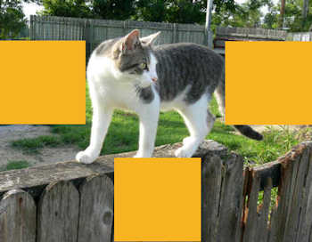
I introduced your beloved cat in this photograph last week (minus the yellow squares).
Two reasons you wouldn't draw or paint this photo as it is:
1. Really lackluster surroundings and...
2. Bootsie is standing in almost the exact center of the space. All of the yellow squares are exactly the same size.
The human eye craves variety.
First of 3 Simple Ways To Generate Visual Excitement
Part of Story-telling Art Secret #2 is to create variety in the distances between your subject and the edges of your art.
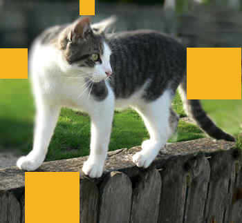
That often means you need to change what your reference shows.
Like what you've done here.
By coming in closer to Bootsie you created more excitement to your story by using spatial variety and…
The way you positioned the star of the picture also created a feeling of curiosity about what's happening here.
Bootsie seems ready to walk out of the picture. But suddenly something catches her eye. What could it be?
This is only one example of how you can use design to accomplish several things at once.
Would you like to know more ways to do that?
Second Simple Way To Generate Visual Excitement
Design all of the space in your drawing or painting.
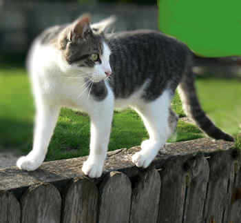
As a general rule leaving flat, empty spaces is not a good idea.
They either compete with the more important areas of your art or create dead spots that aren't interesting.
Notice that if this were art, there are texture and tonal differences everywhere but in the flat color in the upper right.
That fact calls attention to that area. And away from the star.
Third Simple Way To Generate Visual Excitement
This third guideline ties in with the first. Be careful if you crop your subject. Give your subject room to breathe.
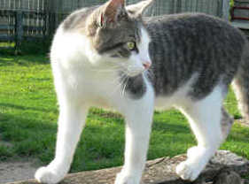
There is seldom a good reason to chop off part of your star.
Yet I've seen people run their star off the edge of the art or right up to the edge.
In this picture there is really no reason to chop off part of Bootsie's ears or her tail or her paw.
Unless you are specifically trying to create a feeling of being closed in or confined, give your subject some room to breathe.
Best Wishes,
Gary Gumble
Founder of BeginningArtist.com
Without art the crudeness of reality would make the world unbearable. (George Bernard Shaw)
P.S. As I've mentioned before, these story-telling art secrets pertain to any subject.
The better you create a good story in your art and evoke the emotions of the viewer, the stronger your piece will be.
The better you design your art, the more visual and emotional excitement you generate.
Isn't that what you want in your art?
Each of the blog posts in this series is a part of how to accomplish that.
I'll mention more in the future.
Right now CLICK HERE if you want to know more secrets to generating visual excitement in your art. Then choose all that you would like to know.
Copyright Gary Gumble 2023 All rights reserved About Privacy Policy Terms of Use Contact www.beginningartist.com 27 rue Roucher, 34000 Montpellier, France