The Enigma Of Less Detail = More Excitement

Wait! If you create the enigma of less detail in your art, won't that make it more boring?
Too often we unconsciously assume that more is always better. I mean, more money is better than less money, right? Having more stuff is better than having less stuff, right?
In art this subconscious belief urges: If you can see it, you should put it in your drawing or painting.
I first noticed this subversive assumption in art school.
In figure drawing class we sometimes had a hugely challenging model named Michael. His was a muscled physique that Michelangelo would have loved.
Not an ounce of fat. Every rippling muscle showed.
So I automatically tried to draw them all.

I ended up with dull drawings that looked as though I was illustrating an anatomy book.
It wasn't until I decided to simplify, to show less detail, that I finally created interesting drawings of him.
This is the enigma of less detail.
The same thing happens when painting.
What you leave out can often produce more excitement in what you show.
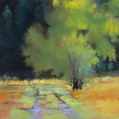
A good example of this is artist Janice Wall's painting of this tree. Its utter simplicity is what makes it so striking.
The tree is just a shape with enough color variation to make it interesting.
She barely indicates a trunk and a few branches. And she creates just enough detail in the foreground to lead you into the art.
In contrast the background is dark and devoid of detail. That keeps your focus on her star.
Can you imagine what it would feel like to create this kind of quiet excitement in your own work?
That’s the enigma of less detail.
When you know how to simplify, you see why less detail often creates more excitement in almost any subject.

Almost any subject.
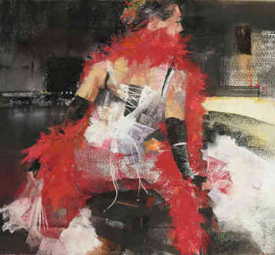
In this example Jan has simplified almost to the point of abstraction.
Yet your imagination still recognizes what the subject is.
And that is really the secret to creating more excitement in your work.
Stimulating the viewer's imagination to provide the details you only suggest…
And create his or her own story about what you show.
Again, the enigma of less detail equals more excitement.

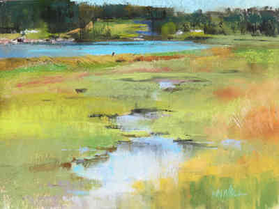
Here is one last example of how less detail is visually more interesting. Jan did this painting plein air, meaning outdoors at this actual place.
Again she uses small color changes to suggest the grasses and weeds in the foreground.
Because they aren't the stars.
The pools of water lead you into the background where she again uses subtle color changes to suggest trees.
All very simplified. Certainly a lot less detail than was really there.
Yet you have no trouble understanding exactly what her painting shows.
And being excited by its simplicity.
The enigma of less detail in action.
Best Wishes,
Gary Gumble
Founder of BeginningArtist.com
Without art the crudeness of reality would make the world unbearable. (George Bernard Shaw)
P.S. If you wanted to emulate what Jan Wall has done, how would you do that? Where would you start?
How would you decide what to show and what should disappear from your art?
And what would be your best next step toward achieving that kind of simplicity in your work?
I fully realize these can be hard questions to answer.
But, as you've seen in Jan's work, the answers are worth pursuing.
And I might just have the solution for you in the near future.
Copyright Gary Gumble 2023 All rights reserved About Privacy Policy Terms of Use Contact www.beginningartist.com 27 rue Roucher, 34000 Montpellier, France