The Art of C. Michael Dudash
By simplifying all or part of your image and using your imagination you can create visual surprise.
You create visual surprise by doing something different, something the viewer isn't expecting. Doing the unexpected can draw the viewer into your art, because by not telling the viewer everything, you trigger his or her imagination.
Anytime you can involve the viewer's imagination, you make your art much more exciting.
This week I want to expand on that concept a bit more.
I want to show you how artist/illustrator C. Michael Dudash very creatively used this idea of simplifying things into simple shapes in his paintings.
Along with the work of the other illustrators (Mark English, David Grove and Robert Heindel), Michael Dudash's paintings were for years an inspiration to me.
You see, my problem for quite a few years was the tendency to be too damn realistic. I longed to paint more freely and simply, like the illustrators I admired.
Even though I didn't paint in oils, studying their work helped me gradually reach a style of painting I really enjoy and their ideas inspired my creativity. I'm hoping they may do the same for you.
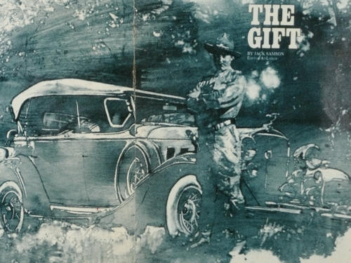
Take this first example from early in Michael's Dudash's career. It was for a story in Field and Stream or Sports Afield magazine.

I want you pay particular attention to how simply – and how interestingly – this painting was done. Feel how you are drawn into it, because he leaves a lot to your imagination.
Michael's technique consisted of applying a thin layer of darker oil paint and then removing it where he wanted light areas.
Look at how simply the trees in the background are done – just sky holes here and there. The same is true of the car. By simplifying, he only needed to show strategically placed highlights and your imagination supplies the rest.
Notice he used those strategically placed highlights to create a path for your eyes to flow through the painting.
Your eyes go first to the man, the star of this picture, and then follow the roof to the left. Then you follow the highlights down to the rear tire. He rubs some paint off to represent grass which brings your eyes back to the man.
He created the same sort of path around the front of the car.
Mystery and visual surprise everywhere.
All from simplifying, painting less, not more, and involving your imagination.

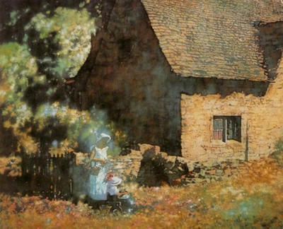
And speak of imagination. The painting above is a favorite of mine. I love how Michael has not painted trees although that is what they are.
He instead paints the light on the trees and sinuously curves that glow around to join the woman and her child, the stars of the painting.
If that weren't enough, he also creates a dark shadow in the lower left that is one dark color with some strategically placed highlights to define a fence and lead you to the woman and child.
The people are greatly simplified with very little detail. Most of the detail is in their surroundings.
I don't know about you, but I can't help but say, "Wow" whenever I see this painting. I look at the glow of the trees and think, "Man, how can I use that Idea in a painting? I love it."
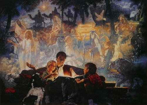
This next painting is a much more complicated design overall, but look how most of the elements in it have been simplified, just like in the previous paintings.

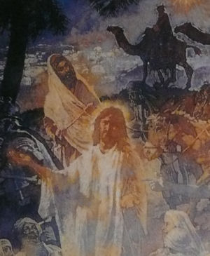
You can better see what I mean in the close-up below. The elements in the background are painted quite flatly and simply, like the first painting I showed you of the man and the car.

Here he must have spent a good deal of time to work out this idea, so the shapes were simplified and he had an interesting arrangement of light and shadow areas.
Just like in the exercise I showed you in last week's email, once he was done simplifying and had developed an interesting arrangement of dark and light values, he could use just about any colors he wanted.
It is the interesting arrangement of dark and light values that often decide the success or failure of your painting, not necessarily the colors you use.
That is why in all my teaching I emphasize the three S's: See, Simplify and Structure. You can read more about them here.
See the world as simple shapes and see with your imagination.
Simplify, so you only show what is necessary to involve the viewer's imagination.
Create a Structure or design for your painting. Provide a path for the viewer's eyes to follow.
Often that path is created with the arrangement of dark and light values.
If you study Michael's paintings, you will see the three S's at work all through them.
Now, what ideas of Michael's could you use in your own work and how are you going to incorporate the three S's in that work?
Go from The Art of Michael Dudash to Art Tips and Articles
Go from The Art of Michael Dudash to The Art of Robert Heindel
Go from The Art of Michael Dudash to The Art of David Grove
Go from The Art of Michael Dudash to The Art of Mark English
Go to Home Page
Copyright Gary Gumble 2023 All rights reserved About Privacy Policy Terms of Use Contact www.beginningartist.com 27 rue Roucher, 34000 Montpellier, France