Simple Art Fixes For Hidden Problems in Your Photograph

The most important secret for creating simple art fixes for hidden problems in your photographs is...
...to first recognize that there really are problems in your photograph...
That will cause problems in your art.
Now I know that recognizing these problems is not always easy to do... not because you need glasses....
...but because of the emotions attached to your photograph.
Think about this.
When you have a scene you are excited to paint...
It is so easy to just jump into painting that scene before taking a hard look at it.
And hunting for anything in the photograph that could wreck your art.
One of the things I discovered through my own mistakes is that the beautiful photograph you shot comes with all the emotions you felt when you took it.
You remember how the sun felt on your face. What the air felt like. You remember who you were with and the pleasure you felt being in that place.
All great reasons to want to paint that scene, but here’s the thing...
All those warm, fuzzy emotions can blind you to the hidden problems in that scene that can ruin your art.
Simple Art Fixes For Hidden Problems
In Your Photograph
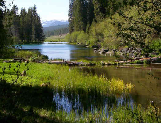
Here's a great example of a beautiful scene with hidden traps. It's one a subscriber to this blog sent me.
Beautiful scene, right?
What stumped my subscriber was she couldn’t figure out why her art refused to come out as well as she had hoped.
What could possibly be a problem in this scene?

Well, one easily overlooked problem is the eye-grabbing line formed by the edge of the dark trees in the middle of the photograph and their reflection in the water.
That dark line divides this scene almost in half....
And immediately grabs your eyes and pulls them to the far background area between the trees.
This is the first area that needs a simple art fix for a hidden problem in your photograph.
What Is The Star Of This Picture?
Is the tiny mountain in the background the star? Your eyes are pulled to that area.
Or is that flat patch of water between the trees the star?
To me, both those areas are nice parts of the overall scene.
But just aren’t interesting enough to create that little bit of excitement...
That little bit of contrast that grabs the viewer’s attention like a star should.
This is where you need to recognize that this lack of a clear star could be hazardous to your art.
And needs one of those simple art fixes for hidden problems in your photograph.
How A Star Is Born
As I mentioned, the first step in eliminating problems is to recognize they exist.
Neither those dark trees nor the background mountain move my "excitometer."
For me the stream is the element in this photograph that could be the most interesting.
And has the most potential to create something a little more interesting with a little more action.
To find what that something might be, it's always a great idea to solve these problems in sketches...
...before you ever start to paint.
That's what I did to figure out my simple art fixes for the hidden problems in this photograph.
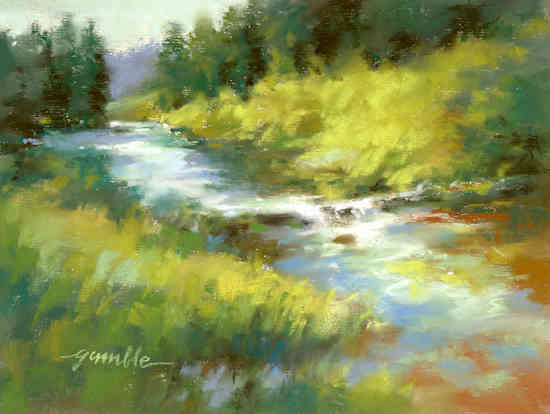
First, I decided to change those dark trees – make them less prominent – and removed their reflection in the water.
Now I could put more emphasis on the whole stream and could create my star in the middle of it.
Just a little waterfall where it flows over the log. (I'll show you something interesting about this little waterfall in a moment.)
The other simple fixes I did concern changing the values of the colors in the photograph.
Notice how I've made the blue in the water less intense and used it all the way from the background to the foreground.

That gives the stream more continuity.
And now the stream creates a nice diagonal across the art.
To help direct your eyes down that diagonal I've used some reddish brown in the water to help pull your eyes to that lower right quarter of the art.
I've also changed the values in the foreground grass and changed the shape of the lightest area there.
Now it isn't so attention-grabbing that it distracts from the star.
The last thing I want to emphasize is that the fixes I've created are not the only things that might work.
The particular colors I've used aren't the only ones you could use.
They are just this artist's suggestions.
Best Wishes,
Gary Gumble
Founder of BeginningArtist.com
Without art the crudeness of reality would make the world unbearable. (George Bernard Shaw)
P.S. One more thing I think you might find interesting.
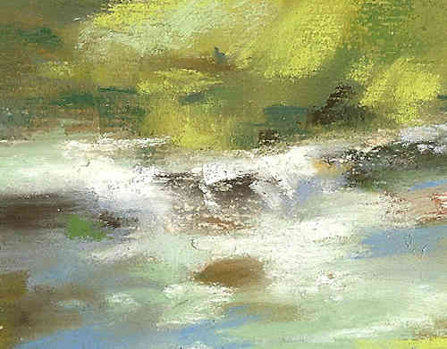
I did this small study using pastels.
And a color painting tip regarding pastels (or any medium) is they look best when they aren't overworked.

Notice in this close-up that some areas have been smoothed or blended.
But I contrast that with areas where the paint was applied directly and left untouched.
As an artist once said, "Art is like golf. The fewer strokes I make, the better the art."
Copyright Gary Gumble 2023 All rights reserved About Privacy Policy Terms of Use Contact www.beginningartist.com 27 rue Roucher, 34000 Montpellier, France